Published by on 26 Sep 2010 at 12:16 pm
The past decade: warmer or cooler? Response to a reader II
This is the second of several posts responding to a reader, sTeve, who commented on my NOAA blog article (to read the first post, click here). sTeve wrote, in part:
You offer the cherry-picked denier meme of the earth “cooling since 1998″, yet you already know that that argument has no merit, as it has been debunked countless times. You don’t mention the very strong El Nino of 1998, which had a major impact on global temps; perhaps you should read the papers written on that subject. Here’s a link to get you started: www . skepticalscience.com/global-warming-stopped-in-1998.htm
You already are aware that 1998 is no longer the warmest year on record, having been surpassed by both 2005 and, so far, 2010, yes?
When I first read this from sTeve, I was astonished, just as I was astonished by NOAA’s recent announcement that the planet had warmed .2° Celsius in the decade 2000-2009. Where had sTeve gotten this data? 2005 and 2010 warmer than 1998? Fortunately, a post by Steve Goddard on Anthony Watt’s Watt’s Up With That? site provided the answer.
Temperature estimates
Figure 1 is the Goddard Institute of Space Studies (GISS) estimate of temperatures from 1880 to 2010 and, sure enough, in the upper right corner, the temperatures for 2005 and 2010 are shown as higher than 1998—considerably higher, actually.
However, the temperature estimates from the other three major climate monitoring agencies—the Hadley Meteorological Centre (HadCrut), University of Huntsville at Alabama (UAH) and Remote Sensing Systems (RSS)—all show temperatures for the last decade considerably lower than the GISS estimate. In fact, they even show some cooling. The latter two agencies, UAH and RSS, rely on satellite data, which many regard as more reliable than ground temperature estimates. The UAH reading is shown in Figure 2.
Figure 3 shows the two satellite-based agencies combined:
Neither UAH nor RSS shows 2000-2010 temperatures as higher than 1998. In fact, the last decade’s temperatures are considerably lower.
Finally, Hadley, the other major ground-temperature monitoring agency apart from GISS, has 21st century temperatures as shown in Figure 4. Once again, 1998 is well above any temperature up to 2010. (The green line is the temperature trend from 1998-2010: flat. No warming.) Indeed, as noted in my previous post, the Climategate emails show Hadley operatives in near-despair over the warming that was supposed to be occurring and didn’t.
Finally, Figure 5, from Goddard’s post, shows a comparison of the trend estimates by GISS, Hadley, UAH and RSS:
The fast-rising green line is GISS, blue is UAH, purple is RSS and the bottom red line is Hadley. Both RSS and Hadley show slowly rising temperatures from 1998, a mere .02°C in 12 years. UAH is in the middle, with a temperature increase of .04°C for the decade, also a low figure. GISS, on the other hand, shows an increase of almost .2°C. In other words, for RSS and Hadley, any temperature increase in the past decade has been statistically insignificant(.02°C). Which is what former Hadley director Phil Jones said in February 2010 in an interview with the BBC: there has been no “statistically significant” warming since 1995, and since 2002 there may have been some cooling, although he doesn’t consider this cooling “statistically significant.” Of the two options, though, he prefers the “statistically insignificant” warming over the “statistically insigificant” cooling.
GISS estimates seem suspiciously high
As Goddard notes in his post, although not in quite these words, the GISS estimate is suspiciously high. Another Goddard post has two GISS charts—raw and “adjusted”—alternating to show the extent of these adjustments. Why would GISS do this? Could it be because GISS is run by James Hansen, one of the most rabid of the warming doomsayers, and someone with a huge vested interest in showing temperatures as going high—very high?
After all, it was Hansen who, in 1988, started global warming alarmism on its way with his estimates of very high temperatures in the coming decades, as shown in Figure 6 (from a post by UAH climatologist John Christy):

More recently, Hansen has predicted that sea levels will rise five metres (16 feet) over the next century due to carbon-caused warming, a view that is extreme even by warmist standards, and Hansen has even urged sabotage of coal plants. In other words, Hansen’s reputation, both scientifically and politically, is hugely dependent on the planet continuing to warm uncontrollably.
(And, as an aside, here’s why I tend to dismiss most of the material coming from the Skeptical Science site that sTeve recommends. A recent post there defended Hansen’s 1988 estimates as consistent with the temperature record over the past two decades. However, to defend Hansen, the writer has to use the GISS temperatures, which appear to be inflated. And the writer prefers to dismiss Hansen’s wilder claims, the two higher estimates (GISS-A and -B), as “what if”, outlier possibilities. In fact, as Hansen’s bizarre recent claims reveal quite clearly, the extreme claims were the predictions he believed in 1988 and believes today are most likely. Hansen’s predictions are wrong. Period. Why not just accept that?)
Hansen’s vested interest could explain why, as Goddard notes in his post, the GISS temperature estimates are consistently “adjusted” to be higher than the other agencies. It is clearly the GISS figures that NOAA used when it made its (absurd) claim that the past decade had increased in warmth by .2°C, which is a third of the warming for the entire 20th century. Meanwhile, according to NOAA’s own figures, the United States dropped in temperature by .4°C (see for yourself by clicking here).
Temperatures ‘adjusted’ in New Zealand, too
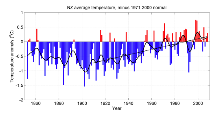
From New Zealand comes another example of climate alarmists “adjusting” temperatures upward to claim global warming that isn’t, in fact, occurring, as shown by Joanne Nova‘s excellent blog. The New Zealand temperatures from 1853-2008, as “adjusted” by New Zealand’s National Institute of Water and Atmospheric Research (NIWA), show an increase from 1909-2008 of .9°C. (By comparison, the IPCC’s estimate of the global temperature increase over the whole of the 20th century is only .6°C.) NIWA’s temperature graph is shown below (Figure 7). Note the rising temperature line from 1909.

However, NIWA also publishes its raw temperature records. When skeptics used the raw, “unadjusted” numbers, they got Figure 8, which shows a flat temperature trend:
In other words, NIWA had reworked its temperatures, as GISS does, to get warming, even considerable warming, where none existed. And so, while most scientists change the hypotheses to fit the data, alarmist climate scientists prefer to change the data to fit the anthropogenic warming hypothesis.
The other intriguing aspect of the New Zealand case is that when the New Zealand Climate Science Coalition took NIWA to court over its distorted figures, NIWA claimed there is no “official” temperature record, and therefore it couldn’t be held responsible for what the figures showed. However, NIWA was quite happy to promote the data if it showed a warming trend that, as the skeptics have pointed out, is essential to NIWA members getting large research grants.
Summing up: My question for sTeve is: why would you choose the GISS estimate of temperatures, which shows parts of the past decade as higher than 1998 and considerable average warming, over the other three monitoring agencies, which show much less or no warming for the decade? How can you be so sure—”dead sure”—that GISS has got it right and the others don’t? Why are you so uncritical of Hansen’s failed prediction in 1988, despite what Skeptical Science says? And why accuse skeptics of being “dead wrong” when the skeptical perception of climate in the last decade is consistent with Hadley, RSS, and UAH (i.e., no statistically significant warming)? Why not keep, at least, an open mind?
In a future post I’ll deal with a few more of the issues brought up in sTeve’s comment, which, again, can be read in full by clicking here.


David Shaw on 24 Jul 2012 at 2:54 am #
I don’t think we should be getting into fitting straight lines to time series cyclical data and concluding much really. It is not the skeptics hypothesis that the world is warming at an alarming rate and that is increasing (The head of IPCC). It is for those making such claims to support their hypothesis otherwise the null cannot be rejected. Currently the data (eyeball analysis) do not support the warming hypothesis, hence we cannot reject the null. The null does not need support.
If we look at the trends since records began, noting that there are longitudinal problems (changes in locations of weather stations, + UHI effects) and contamination by human analysts (data trickery), the trends seem cyclical in periods of around 60 years. First they increase as in pre-WW2 then decrease (30 year periods). Then pre 2000 we have another 30 years and now we will presumably have a cooling 30 years. It’s not rocket science although as usual the biases introduced by mans assumptions are often harder to model than simple observational trends, they just create noise around definite natural trends.
As a golden rule if you cannot see things with your eye then it’s not there. No matter how fancy the statistics become (and they can do) if you couldn’t see it without the fancy stuff then it’s likely that the fancy stuff made it. Fancy stuff can only aid in removal of sources of noise that might mask (actually bias in either way) what appears a signal already evident.
Jeff152 on 31 Aug 2013 at 6:41 am #
These arguments miss the whole point between measuring real temps or a anomaly. GW discussions exist all over the web that the global earth temp is impossible to determine (which it is) but anomalies are good because they can determine trends (which they do). However we can not mix them; anomaly data does not show the temp of the earth but only a trend of a small data sample and should not be used to debate if one year was hotter than the next be it 1998, 2005 or 2010. Certainly not withing the tenth of a degree accuracy (questionable) of this data. This always bugs me when the media uses this type of record breaking data as a attention grabber to scare people who don’t know the difference between an anomaly and the total average temp of the earth (this is what the average person thinks when they hear this debate), it is totally misleading. Truth, we don’t know what year the earth was the hottest over the past two decades. We only know that his sample of data indicate a trend upward (thats a plus for GW) but is significantly less than what has been projected by the climate models (thats a minus for GW).
Hopefully this is something both sides of the debate can agree on and both sides can instruct reporters on the error of thier ways.