Published by on 27 Nov 2010 at 04:13 pm
The ‘accelerated’ warming that wasn’t….
In 2008, IPCC president Rajendra Pachauri told an audience in Australia: “We’re at a stage where warming is taking place at a much faster rate [than before].” Globe and Mail columnist Geoffrey Simpson wrote in 2009: “Climate-warming predictions of three or four years ago are already out of date. New science suggests an even faster warming than had been thought possible.” [italics added in both cases]
This week (Nov. 25, 2010), Vicky Pope of the British Meteorological Office announced: “There’s a very clear warming trend but it’s not as rapid as it was before.” [italics added] She said that while the average temperature had been rising at about 0.16 degrees per decade since the 1970s, the rate through the 2000s had been from 0.05 to 0.13 degrees.
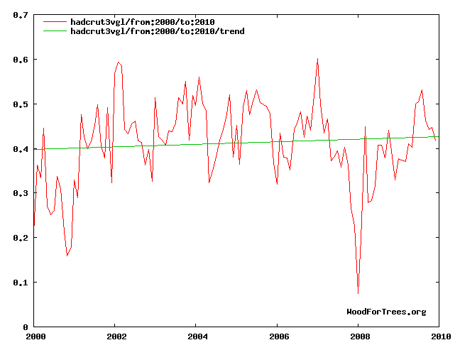
The figure of 0.05 to 0.13° Celsius is also suspect. The figures from the Met Office’s Hadley Institute show nothing of the kind (see Figure 1).
The increase shown here is about .01°C. Extrapolated over the rest of the century, the temperature increase (aka “global warming” or “climate disruption”) would be .1°C, or one-sixth the .6°C increase claimed for the 20th century.
As part of her announcement, Pope also said the Met Office is planning to review the way it reports temperatures. It seems the temperature record isn’t showing the warming the Met expects and wants, so it’s planning to move the goal-posts, as it were, by arbitrarily raising the temperatures for the past decade.
There’s an easier way to go: Accept that the HadCrut temperatures are correct, or as correct as humanly possible, and that the last decade hasn’t warmed as predicted by the anthropogenci global warming hypothesis. Real scientists accept the facts when the facts don’t match the hypothesis; they don’t change their measurement of the data to conform to the hypothesis….
… As the Goddard Institute for Space Studies, James Hansen’s personal fiefdom, does with its figures. Figure 2 is GISS’s estimate of temperatures over the past decade. The figures are clearly inflated (the technical term is “adjusted”) to match the hypothesis of increased, “accelerated” warming. In other words, the Met Office admits warming hasn’t accelerated, while exaggerating (“adjusting”) the tiny bit of warming that its thermometers said did occur, while GISS wildly exaggerates to get accelerated warming. Neither can be trusted.


David Shaw on 24 Jul 2012 at 2:30 am #
Well if you are on the upslope of a cyclic trend then fitting a straight line will give you a positive slope from which you might (some might say falsely) conclude an overall trend. Indeed if you begin from a minimum then the slope will always be positive until the cyclic trend is overcome by another (perhaps unknown) natural trend. Hey, let’s play why not start from a maximum and look at trends.
The 0.05 to 0.13 scenario that was quoted suggests a confidence interval although it looks like this should be centred upon about 0.03 from Figure 1. Of course the misuse of CI’s is common, the upper end allows alarmist statements simply because of the level of uncertainty in the first place. How idiotic is that, less certainty makes one able to make more extreme predictions, shouldn’t that be the converse?
The NASA data are known to be often up-estimated for recent years and down estimated otherwise. Nice data methods bound to give a better slope in support of ones favourite hypothesis. Extreme Bayesian methods where the prior allows modification of the observations.